Tully Runners - Article
[back to Home Page] [back to Articles Page]
Graphical Determination of Race Course Speed
by Bill Meylan (TullyRunners Webmaster)
(first draft: January 2001)
How fast (or how slow) was a specific race course on a specific day relative relative to other race courses?? ... This question must be answered satisfactorily in order to rank X-C runners relative to each other in terms of speed. I use two separate and distinct methods to answer this question ... (1) a graphical determination method and (2) a "reference runner" method. This article describes the graphical determination method ... additional graph information is presented in the article "How Much Faster Was the SUNY Utica Course at the 2000 Sectionals Compared to the 1999 Sectionals??".
Examples are probably the best approach of illustrating this method, so below are a variety of examples from the 2000 X-C season (mostly for girls races). The graphical method requires a "base-line" graph ... for my ranking methodology, the "base-line" graph corresponds to the "standard" race course. As noted in other articles, my "standard" race course is SUNY Utica Tech at the 1999 sectionals (Nov. 6, 1999) ... I selected the 1999 sectional course because everybody in Section 3 was there (maximum amount of raw data for a single day) and the weather and race course were consistently good all day. Here is the graph for the girl's races:
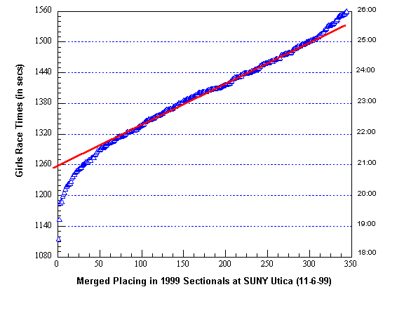
The Y-axis on the graph is "Girls Race Times (in seconds)" ... the X-axis is the merged places of all girls in classes A, B, C and D combined (simply a sequential list of all girl runners from fastest to slowest). The graph above also labels the race times in minutes on the right-hand Y-axis ... however, I convert all race times to seconds because the math is easier when handling just seconds (as compared to minutes and seconds). The blue triangles are the raw data points ... the shape of the graph they form is important ... it's an S-shaped curve with a relatively straight mid-section ... actually, the graph above is chopped-off slightly on the right-side because I did not include runners from 351-450 (see the graph in the article noted above ... the shapes are exactly the same for the girls and boys). The straight red line on the graph is drawn through the straight section of the blue triangles ... for graphical determination of speed, the important determination from the graph is "where the red line crosses the left-hand Y-axis" (this is the statistical intercept point). The intercept point on the girl's base-line graph above is 1260 seconds (or 21:00 minutes).
As background ... whenever you plot a distance race (time vs place ... XC race, road race with a sufficient number of runners) you will always get the same shape curve (an S-shaped curve with a relatively straight line mid-section). The straight mid-section corresponds to what I call the "average" runners ... the curve on the left-side corresponds to the "elite" and better "above average" runners. The S-shape curve also corresponds to a statistical "probability distribution" curve (the probability of placement in this particular case).
Now this is important ... the base-line graph above is for combined Section III girl runners ... it can be used directly only for races that are comprised of girl runners similar in ability to the average Section III girls. This may sound restrictive but it really isn't ... nearly all invitationals and championship races in Section III include large numbers of "average" runners. In addition, "average" runners in many other NY sections are similar to the "average" runners in Section III.
Now some examples ... here is the graph for the 2000 Section III sectionals:
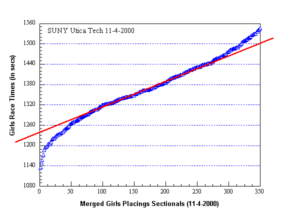
The red line crosses the intercept point at 1240 seconds ... the base-line intercept is 1260 seconds ... therefore, the SUNY Utica course was 20 seconds faster at 2000 sectionals compared to the 1999 sectionals (this is exactly the same course correction as the boys graphical determination).
With fewer data points, the graphs are not "smooth" as the base-line graph and placement of the red line is more difficult.
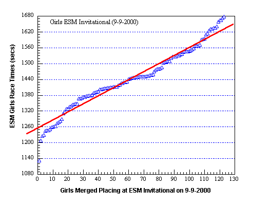
Above is the graph for the ESM Invitational (intercept point is 1255 seconds or 5 seconds faster than base-line). The red line can be drawn by experienced "eyeballing" or using some statistical data smoothing that calculates the red line's equation ... I usually use the "eyeball" method. When "eyeballing", the first hint is to exclude all the data points in curve parts of the S-shaped curve ... remember, this method focuses on the "average" runners ... when the curve points are removed, the straight line is much easier to see (just use your fingers or pieces of paper to block-out the curve points).
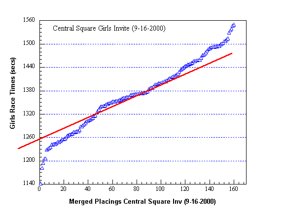
The Central Square graph (and red line placement) illustrates several points. First, an invitational can include a higher than average number of elite-above average runners and teams ... that's the case here (Liverpool, FM, Beaver River, CNS, Waterloo, Tully) ... this extends the elite-above average curve section as can be seen above. We need to identify the "average" section of the graph ... here again, use your fingers or pieces of paper to block-out the S-curve data points (the average data point range is easy to identify, although it is relatively short).
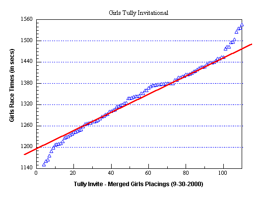
The straight-line section of the Tully Invitational is easy to draw by "eyeballing" ... a large number of "average" runners were in this invitational ... the intercept point is approximately 1200 seconds or 60 seconds faster than base-line ... the actual distance of the Tully course in 2000 was 3.00 miles ... for the 2001 sectionals being held at Tully, the course will likely be extended to 3.10 miles by moving the starting line back somewhat and widen the turns around the softball field.
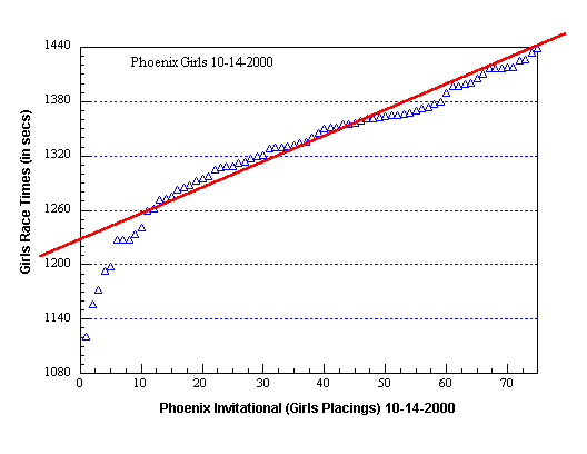
Placement of the red line on the Phoenix Invitational graph is straight forwarded ... the intercept point is 1227 seconds or 33 seconds faster than base-line.
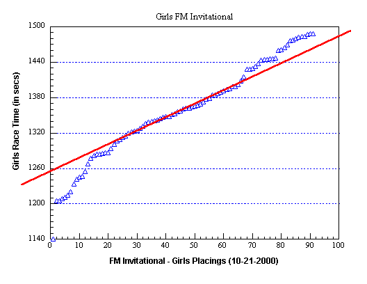
The FM Invitational graph is another good example where blocking-out the curve data points makes the straight line section clearly visible ... intercept point is 1255 seconds.

The OHSL Championship has an intercept of 1233 seconds ... 27 seconds faster than base-line. Below is an interesting boy's example.
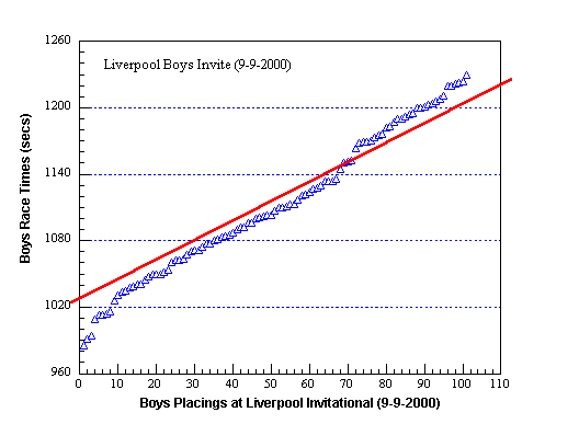
Note the placement of the red line for the Boys Liverpool Invitational ... I drew it between two separate straight line sections of the graph. Why? ... the Liverpool Invite is not run like a typical invitational ... it's run two separate sections ... in the first section, runners #1, #2 and #3 from each team compete against each other ... in section two, runners #4, #5, #6 and #7 compete against each other. When merged, the separate sections are clearly visible (the graph above does not include placings above 100 where more section two runners where placed). The boy's base-line is 1070 seconds ... the intercept above is 1030 seconds.